
Branding
Les Grands Ballets
Intro
Les Grands Ballets has proved to sway their audiences with their storytelling since their founding. The dancers’ abilities to bring old and new stories to life so naturally is remarkable. A new image mimicking the dancers’ heart will project their legacy more accurately and expand their audience, proving that ballet is timeless.
Brief
I was tasked with rebranding Les Grands Ballets.
Design Thinking
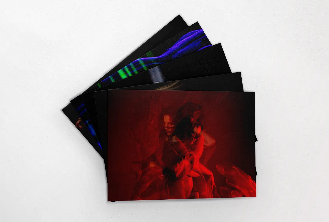
When approaching this project, i wanted my concept to be something in line with rhythm and movement. I based my rational on the last show I saw of theirs and thought of how it could inspire me in this rebrand. I wanted to touch the history they have, with the repeat classical shows, and how they keep building that history with several new shows contemporary shows.
Design Making
To represent the brand I thought focusing on the actors was a key aspect. I used a typeface that moved like the professional dancers with more exaggerated italics and its opposite, retalic. The spacing of the letters can be however as each show plays with different characters, sets and stories. This translate in the other application of the brand and can create a consistent e and versatile language.
See Less
Storytelling &
movement


.webp)
.webp)

Back to top
AboutWork
